Responsive Design in Tailwind CSS Explained
Learn responsive design in Tailwind CSS with practical examples. Understand breakpoints, mobile-first development, responsive layouts, Flexbox, Grid, and modern UI techniques.
Responsive Design in Tailwind CSS: Build Websites for Every Screen Size
Modern users visit websites from many different devices.
Your visitors may be using:
- smartphones
- tablets
- laptops
- desktop computers
- large monitors
If your website only looks good on one screen size, users will have a poor experience.
Responsive design solves this problem by making layouts adapt automatically to different screen sizes.
Tailwind CSS provides a mobile-first responsive system that makes responsive development simple and efficient.
In this guide, you'll learn how responsive design works and how to create responsive layouts using Tailwind CSS.
What is Responsive Design?
Responsive design is the practice of creating websites that automatically adjust to different screen sizes.
A responsive website should:
- look good on mobile devices
- adapt to tablets
- scale properly on desktops
- remain easy to use on all screen sizes
Modern websites must be responsive because a large percentage of web traffic comes from mobile devices.
Why Responsive Design Matters
Responsive websites help:
- improve user experience
- increase engagement
- reduce bounce rates
- improve accessibility
- support SEO
Search engines also prioritize mobile-friendly websites.
Tailwind CSS Uses a Mobile-First Approach
Tailwind follows a mobile-first strategy.
This means:
- Mobile styles are written first.
- Larger screen styles are added using breakpoints.
Example:
  <h1
  class="
    text-xl
    md:text-3xl
    lg:text-5xl
  "
>
  Responsive Heading
</h1>
Behavior:
| Screen Size | Font Size |
|---|---|
| Mobile | text-xl |
| Tablet | text-3xl |
| Desktop | text-5xl |
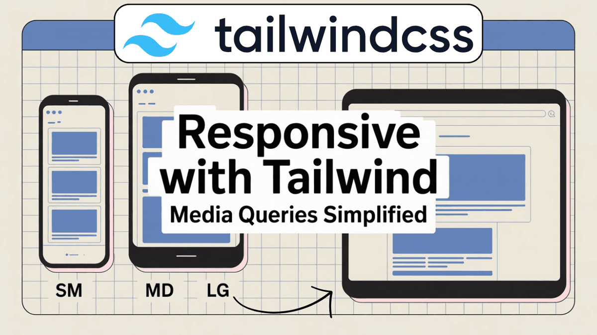
Understanding Tailwind Breakpoints
Tailwind provides predefined breakpoints.
| Prefix | Screen Size |
|---|---|
| sm: | ≥ 640px |
| md: | ≥ 768px |
| lg: | ≥ 1024px |
| xl: | ≥ 1280px |
| 2xl: | ≥ 1536px |
These prefixes allow styles to change based on screen width.
Responsive Text
Example:
  <h1
  class="
    text-2xl
    md:text-4xl
    lg:text-6xl
  "
>
  Learn Tailwind CSS
</h1>
The heading grows as the screen becomes larger.
Responsive Width
Example:
  <div
  class="
    w-full
    md:w-1/2
    lg:w-1/3
  "
>
  Card
</div>
Behavior:
| Device | Width |
|---|---|
| Mobile | 100% |
| Tablet | 50% |
| Desktop | 33% |
Responsive Flexbox Layout
Example:
  <div
  class="
    flex
    flex-col
    md:flex-row
    gap-6
  "
>

  <div>Left Section</div>

  <div>Right Section</div>

</div>
Behavior:
- Mobile → Vertical layout
- Tablet & Desktop → Horizontal layout
This pattern is used frequently in modern websites.
Responsive Grid Layout
Example:
  <div
  class="
    grid
    grid-cols-1
    md:grid-cols-2
    lg:grid-cols-3
    gap-6
  "
>

  <div>Card</div>

  <div>Card</div>

  <div>Card</div>

</div>
Behavior:
| Screen Size | Columns |
|---|---|
| Mobile | 1 |
| Tablet | 2 |
| Desktop | 3 |
Perfect for:
- blog cards
- product listings
- portfolios
Responsive Navigation Menu
Example:
  <nav
  class="
    flex
    flex-col
    md:flex-row
    justify-between
    items-center
    gap-4
  "
>

  <h2>DevBlog</h2>

  <ul
    class="
      flex
      gap-4
    "
  >
    <li>Home</li>
    <li>Blog</li>
    <li>About</li>
  </ul>

</nav>
The layout automatically adapts across devices.
Responsive Spacing
Spacing can also change based on screen size.
Example:
  <section
  class="
    p-4
    md:p-8
    lg:p-16
  "
>
  Content
</section>
Behavior:
| Device | Padding |
|---|---|
| Mobile | Small |
| Tablet | Medium |
| Desktop | Large |
Responsive Visibility
Show or hide elements depending on screen size.
Hide on Mobile
  <div
  class="
    hidden
    md:block
  "
>
  Desktop Content
</div>
Show Only on Mobile
  <div
  class="
    block
    md:hidden
  "
>
  Mobile Content
</div>
Useful for mobile navigation menus.
Real-World Example: Hero Section
  <section
  class="
    min-h-screen
    flex
    flex-col
    justify-center
    items-center
    text-center
    px-4
  "
>

  <h1
    class="
      text-3xl
      md:text-5xl
      lg:text-7xl
      font-bold
    "
  >
    Learn Web Development
  </h1>

  <p
    class="
      mt-4
      text-base
      md:text-lg
    "
  >
    Build modern websites with confidence.
  </p>

</section>
This creates a fully responsive hero section.
Responsive Blog Layout
For your developer blog:
  <article
  class="
    max-w-4xl
    mx-auto
    px-4
    md:px-8
  "
>
  Blog Content
</article>
This improves readability on both mobile and desktop devices.
Visualizing Responsive Breakpoints
  Mobile
|
| 640px
v
sm

| 768px
v
md

| 1024px
v
lg

| 1280px
v
xl

| 1536px
v
2xl
Understanding breakpoints is critical for responsive design.
Utility Class Cheat Sheet
  sm:
md:
lg:
xl:
2xl:

hidden
block

flex-col
md:flex-row

grid-cols-1
md:grid-cols-2
lg:grid-cols-3

text-xl
md:text-3xl
lg:text-5xl
These are among the most commonly used responsive utilities.
Watch Full Tailwind Responsive Design Tutorial
If you prefer video learning, watch the complete tutorial below where we build responsive layouts, navigation bars, hero sections, and grids using Tailwind CSS.
Watch the Full Tailwind CSS Responsive Design Tutorial
This tutorial demonstrates practical responsive techniques used in real-world applications.
Common Beginner Mistakes
Designing for Desktop First
Tailwind is mobile-first.
Start with mobile styles and progressively enhance for larger screens.
Ignoring Small Devices
Always test layouts on mobile phones.
Many users will visit your website from mobile devices.
Using Fixed Widths
Fixed widths often break responsive layouts.
Prefer:
  w-full
max-w-*
patterns.
Not Testing Different Screen Sizes
Use browser developer tools to test responsiveness.
Internal Learning Recommendation
Before learning responsive design, make sure you understand:
These concepts form the foundation of responsive development.
Build Something
Practice what you've learned by creating:
- Responsive Navigation Bar
- Responsive Blog Homepage
- Product Listing Page
- Portfolio Website
- Landing Page Hero Section
Responsive projects provide the best learning experience.
Production Tip
Professional developers usually:
- design mobile-first
- use responsive typography
- combine Grid and Flexbox
- test on multiple screen sizes
- optimize spacing for mobile users
A responsive design is no longer optional in modern web development.
Why Responsive Design Matters
Responsive design helps developers:
- reach more users
- improve SEO
- enhance usability
- create professional websites
- support all modern devices
It is one of the most important frontend development skills.
Conclusion
Responsive design ensures that websites look and function properly on every device.
Tailwind CSS simplifies responsive development through mobile-first utilities and predefined breakpoints, allowing developers to build adaptive layouts with minimal effort.
By mastering responsive design, you'll be able to create professional websites that deliver an excellent user experience across mobile phones, tablets, laptops, and desktops.