Complete Guide to Tailwind CSS Grid
Learn Tailwind CSS Grid with practical examples. Understand grid columns, rows, gaps, responsive layouts, column spans, and real-world dashboard and blog layouts.
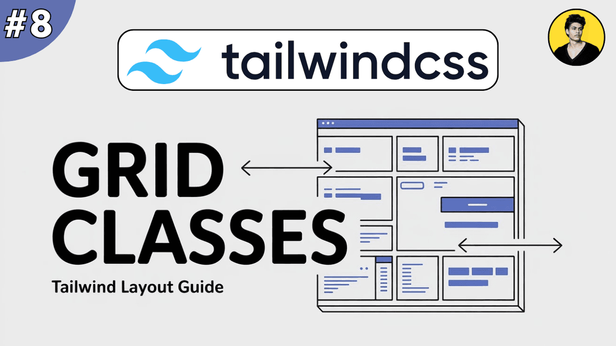
Tailwind CSS Grid Explained: Build Modern Layouts with Ease
As web applications become more advanced, creating complex layouts becomes increasingly important.
While Flexbox is excellent for one-dimensional layouts, Grid is designed for two-dimensional layouts where you need control over both rows and columns.
Modern websites use Grid for:
- dashboards
- admin panels
- image galleries
- pricing sections
- product listings
- complex page layouts
Tailwind CSS makes working with CSS Grid incredibly simple through utility classes.
In this guide, you'll learn how Grid works and how to build responsive layouts using Tailwind CSS.
What is CSS Grid?
CSS Grid is a layout system that allows developers to arrange elements into rows and columns.
Unlike Flexbox, which primarily works in a single direction, Grid gives control over both horizontal and vertical placement.
Example:
  <div class="grid grid-cols-3">
  <div>Item 1</div>
  <div>Item 2</div>
  <div>Item 3</div>
</div>
The container becomes a grid with three columns.
Why Use Grid?
Grid helps developers:
- create complex layouts easily
- build responsive designs
- manage rows and columns simultaneously
- reduce layout-related CSS
- create scalable UI structures
For layouts involving multiple rows and columns, Grid is often the best choice.
Creating a Grid Container
To enable Grid:
  <div class="grid">
  <div>Item 1</div>
  <div>Item 2</div>
</div>
The grid utility transforms the container into a grid container.
Defining Columns
Columns are created using grid-cols-* .
Example:
  <div class="grid grid-cols-3 gap-4">

  <div>1</div>

  <div>2</div>

  <div>3</div>

</div>
This creates three equal-width columns.
Common utilities:
| Class | Columns |
|---|---|
| grid-cols-1 | 1 Column |
| grid-cols-2 | 2 Columns |
| grid-cols-3 | 3 Columns |
| grid-cols-4 | 4 Columns |
| grid-cols-12 | 12 Columns |
Defining Rows
Rows can also be defined explicitly.
Example:
  <div
  class="
    grid
    grid-rows-3
    gap-4
  "
>

  <div>Row 1</div>

  <div>Row 2</div>

  <div>Row 3</div>

</div>
Useful when building dashboard layouts.
Gap Between Grid Items
Instead of margins, Grid commonly uses gaps.
Example:
  <div
  class="
    grid
    grid-cols-3
    gap-6
  "
>

  <div>Card</div>

  <div>Card</div>

  <div>Card</div>

</div>
Common gap utilities:
| Class | Spacing |
|---|---|
| gap-2 | Small |
| gap-4 | Medium |
| gap-6 | Large |
| gap-8 | Extra Large |
Responsive Grid Layouts
Responsive layouts are one of Grid's biggest strengths.
Example:
  <div
  class="
    grid
    grid-cols-1
    md:grid-cols-2
    lg:grid-cols-3
    gap-6
  "
>

  <div>Card 1</div>

  <div>Card 2</div>

  <div>Card 3</div>

</div>
Behavior:
| Screen Size | Columns |
|---|---|
| Mobile | 1 |
| Tablet | 2 |
| Desktop | 3 |
No media queries are required.
Column Span
Grid items can occupy multiple columns.
Example:
  <div
  class="
    grid
    grid-cols-3
    gap-4
  "
>

  <div class="col-span-2">
    Main Content
  </div>

  <div>
    Sidebar
  </div>

</div>
The main content takes two columns.
Common utilities:
| Class | Span |
|---|---|
| col-span-1 | 1 Column |
| col-span-2 | 2 Columns |
| col-span-3 | 3 Columns |
| col-span-full | Entire Grid |
Row Span
Items can also span multiple rows.
Example:
  <div
  class="
    row-span-2
  "
>
  Featured Content
</div>
Useful for dashboards and galleries.
Auto-Fit Responsive Grids
One powerful pattern:
  <div
  class="
    grid
    grid-cols-1
    sm:grid-cols-2
    lg:grid-cols-4
    gap-6
  "
>

  <div>Product</div>

  <div>Product</div>

  <div>Product</div>

  <div>Product</div>

</div>
Perfect for:
- product cards
- portfolios
- blog listings
- feature sections
Real-World Example: Blog Grid
A blog homepage often displays articles in a grid.
  <div
  class="
    grid
    grid-cols-1
    md:grid-cols-2
    lg:grid-cols-3
    gap-8
  "
>

  <article class="shadow-md p-6 rounded-xl">

    <h2 class="font-bold text-xl">
      Blog Post
    </h2>

  </article>

  <article class="shadow-md p-6 rounded-xl">

    <h2 class="font-bold text-xl">
      Blog Post
    </h2>

  </article>

</div>
This pattern is commonly used on developer blogs.
Real-World Example: Dashboard Layout
  <div
  class="
    grid
    grid-cols-12
    gap-6
  "
>

  <aside
    class="
      col-span-3
    "
  >
    Sidebar
  </aside>

  <main
    class="
      col-span-9
    "
  >
    Main Content
  </main>

</div>
A typical dashboard structure.
Flexbox vs Grid
Many developers wonder which layout system to use.
| Feature | Flexbox | Grid |
|---|---|---|
| Layout Type | One-dimensional | Two-dimensional |
| Best For | Navbar, Cards, Headers | Dashboards, Galleries |
| Rows & Columns | Limited | Excellent |
| Learning Curve | Easier | Moderate |
General rule:
- Use Flexbox for alignment and simple layouts.
- Use Grid for page layouts and complex structures.
Utility Class Cheat Sheet
  grid

grid-cols-1
grid-cols-2
grid-cols-3
grid-cols-12

grid-rows-2
grid-rows-3

gap-4
gap-6
gap-8

col-span-2
col-span-3
col-span-full

row-span-2
These are the most commonly used Grid utilities.
Watch Full Tailwind Grid Tutorial
If you prefer video learning, watch the complete tutorial below where we build dashboards, galleries, responsive layouts, and blog grids using Tailwind CSS Grid.
Watch the Full Tailwind CSS Grid Tutorial
This tutorial demonstrates practical Grid layouts used in real-world applications.
Common Beginner Mistakes
Using Grid for Everything
Not every layout needs Grid.
Simple alignment tasks are usually better handled with Flexbox.
Forgetting Responsive Columns
A layout that looks good on desktop may break on mobile.
Always use responsive utilities.
Not Using Gap
Grid layouts should generally use gap utilities instead of margins.
Creating Too Many Columns
Large numbers of columns can make layouts difficult to maintain.
Keep layouts simple and predictable.
Internal Learning Recommendation
Before learning Grid, make sure you understand:
These concepts work together when building responsive layouts.
Build Something
Practice what you've learned by creating:
- Blog Homepage Grid
- Product Listing Page
- Admin Dashboard
- Portfolio Gallery
- Pricing Section
Building real projects is the fastest way to master Grid.
Production Tip
Professional developers usually:
- use Grid for overall page structure
- use Flexbox inside Grid items
- combine Grid with responsive breakpoints
- use consistent gaps
- keep layouts simple and maintainable
A common pattern is:
- Grid for page layout
- Flexbox for component alignment
This approach scales very well in large applications.
Why Grid Matters
Grid helps developers:
- create complex layouts quickly
- build responsive interfaces
- manage rows and columns efficiently
- reduce CSS complexity
- improve layout consistency
It has become one of the most important layout tools in modern frontend development.
Conclusion
CSS Grid is a powerful layout system that allows developers to create responsive and structured layouts using rows and columns.
Tailwind CSS simplifies Grid through utility classes like grid , grid-cols-* , gap-* , and col-span-* , making it easy to build dashboards, galleries, blog layouts, and complex user interfaces.
Once you understand Grid and Flexbox together, you'll be able to build almost any modern web layout with confidence.