Tailwind CSS Box Model Explained
Learn the Box Model in Tailwind CSS with practical examples. Understand content, padding, borders, margins, spacing utilities, and modern layout techniques.
Understanding the Box Model in Tailwind CSS
Every element you create on a webpage is treated as a box by the browser.
Whether it's:
- a button
- a card
- an image
- a navigation menu
- a blog article
every element follows the Box Model.
Understanding the Box Model is one of the most important skills in frontend development because it affects spacing, sizing, layouts, and overall design.
In this guide, you'll learn how the Box Model works and how Tailwind CSS makes it easier to control.
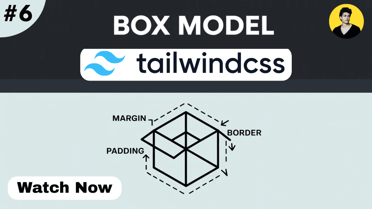
What is the Box Model?
The Box Model describes how the browser calculates the size and spacing of an element.
A box consists of four layers:
  +---------------------+
|       Margin        |
|  +---------------+  |
|  |    Border     |  |
|  | +-----------+ |  |
|  | |  Padding  | |  |
|  | | +-------+ | |  |
|  | | |Content| | |  |
|  | | +-------+ | |  |
|  | +-----------+ |  |
|  +---------------+  |
+---------------------+
The four parts are:
- Content
- Padding
- Border
- Margin
Content Area
The content area contains the actual information.
Examples:
- text
- images
- videos
- buttons
  <div>
  Hello World
</div>
The text inside the div is the content.
Padding
Padding creates space inside an element.
It adds spacing between the content and the border.
Example:
  <div
  class="
    p-6
    bg-blue-500
    text-white
  "
>
  Content
</div>
Result:
The content gets extra space around it.
Common padding utilities:
| Class | Padding |
|---|---|
| p-2 | Small |
| p-4 | Medium |
| p-6 | Large |
| p-8 | Extra Large |
Directional Padding
Tailwind allows padding on specific sides.
Example:
  <div
  class="
    pt-6
    pr-4
    pb-6
    pl-4
  "
>
  Content
</div>
Utilities:
| Class | Direction |
|---|---|
| pt-4 | Top |
| pb-4 | Bottom |
| pl-4 | Left |
| pr-4 | Right |
| px-4 | Left & Right |
| py-4 | Top & Bottom |
Border
The border wraps around the padding and content.
Example:
  <div
  class="
    border
    border-blue-500
    p-4
  "
>
  Content
</div>
This creates a visible border around the element.
Border Width
Example:
  <div
  class="
    border-4
    border-red-500
  "
>
  Content
</div>
Common options:
| Class | Border Width |
|---|---|
| border | 1px |
| border-2 | 2px |
| border-4 | 4px |
| border-8 | 8px |
Margin
Margin creates space outside an element.
Example:
  <div
  class="
    m-6
    bg-green-500
  "
>
  Content
</div>
This pushes surrounding elements away.
Directional Margin
Example:
  <div
  class="
    mt-6
    mb-6
  "
>
  Content
</div>
Utilities:
| Class | Direction |
|---|---|
| mt-4 | Top |
| mb-4 | Bottom |
| ml-4 | Left |
| mr-4 | Right |
| mx-4 | Left & Right |
| my-4 | Top & Bottom |
Visualizing the Difference
Example:
  <div
  class="
    m-8
    border
    p-6
    bg-blue-500
    text-white
  "
>
  Tailwind Box Model
</div>
Explanation:
- Content → Text
- Padding → Space inside
- Border → Outline
- Margin → Space outside
Width and Height with the Box Model
Example:
  <div
  class="
    w-64
    h-32
    p-4
    border
  "
>
  Content
</div>
The final rendered size includes:
- content
- padding
- border
Understanding this is important when building layouts.
Box Sizing
Modern browsers typically use:
box-sizing: border-box;
Tailwind provides:
  <div class="box-border">
  Content
</div>
and
  <div class="box-content">
  Content
</div>
Most modern projects use:
box-border
because sizing becomes easier to manage.
Real-World Example: Card Component
  <div
  class="
    max-w-sm
    p-6
    border
    rounded-xl
    shadow-md
    bg-white
  "
>

  <h2
    class="
      text-xl
      font-bold
    "
  >
    Product Card
  </h2>

  <p class="mt-2">
    Product description.
  </p>

</div>
Box Model Breakdown:
- Content → Heading and paragraph
- Padding → p-6
- Border → border
- Margin → Applied externally if needed
Real-World Example: Blog Container
For technical blogs:
  <article
  class="
    max-w-4xl
    mx-auto
    px-6
    py-10
  "
>
  Blog Content
</article>
This creates:
- readable content width
- comfortable spacing
- better reading experience
Utility Class Cheat Sheet
  p-4
p-6
px-4
py-6

m-4
m-6
mx-auto

border
border-2
border-blue-500

box-border
box-content
These are among the most frequently used Box Model utilities.
Watch Full Tailwind Box Model Tutorial
If you prefer video learning, watch the complete tutorial below where we visualize padding, margins, borders, and sizing with practical examples.
Watch the Full Tailwind CSS Box Model Tutorial
This tutorial demonstrates how spacing and sizing work in real-world projects.
Common Beginner Mistakes
Confusing Margin and Padding
Remember:
- Padding = inside space
- Margin = outside space
This is one of the most common beginner mistakes.
Using Excessive Spacing
Too much margin and padding can make layouts feel disconnected.
Maintain consistent spacing throughout the design.
Ignoring Content Width
A good layout combines spacing with proper width constraints.
Forgetting mx-auto
For centered containers:
max-w-4xl mx-auto
is a very common pattern.
Internal Learning Recommendation
Before learning the Box Model in Tailwind CSS, make sure you understand:
- CSS Box Model
- Tailwind CSS Width and Height
- Tailwind CSS Background Utilities
- Tailwind CSS Typography
These concepts work closely together when building layouts.
Build Something
Practice what you've learned by creating:
- Product Card
- Profile Card
- Blog Layout
- Pricing Card
- Navigation Bar
Focus on using margin, padding, and borders correctly.
Production Tip
Professional developers usually:
- use consistent spacing scales
- prefer utility classes over custom spacing CSS
- create reusable layout patterns
- use max-width containers
- maintain visual balance across pages
Good spacing often has a bigger impact on design quality than colors or animations.
Why the Box Model Matters
The Box Model helps developers:
- understand spacing
- build predictable layouts
- improve responsiveness
- create maintainable designs
- solve alignment issues faster
It is one of the most important concepts in frontend development.
Conclusion
The Box Model is the foundation of every webpage layout.
By understanding content, padding, borders, and margins, you'll be able to create cleaner, more professional interfaces and troubleshoot layout issues more effectively.
As you continue learning Tailwind CSS, mastering the Box Model will make Flexbox, Grid, responsive design, and component development significantly easier.