How the CSS Box Model Works Explained with Examples
Learn how the CSS box model works with practical examples. Understand content, padding, border, margin, box-sizing, spacing, and modern frontend layout techniques.
How the CSS Box Model Works Explained with Examples
The CSS Box Model is one of the most important concepts in frontend development.
Every HTML element on a webpage is treated like a rectangular box.
Understanding the box model properly helps developers control:
- spacing
- layouts
- sizing
- alignment
- UI structure
- responsive design
Modern websites rely heavily on the box model for building clean and scalable interfaces.
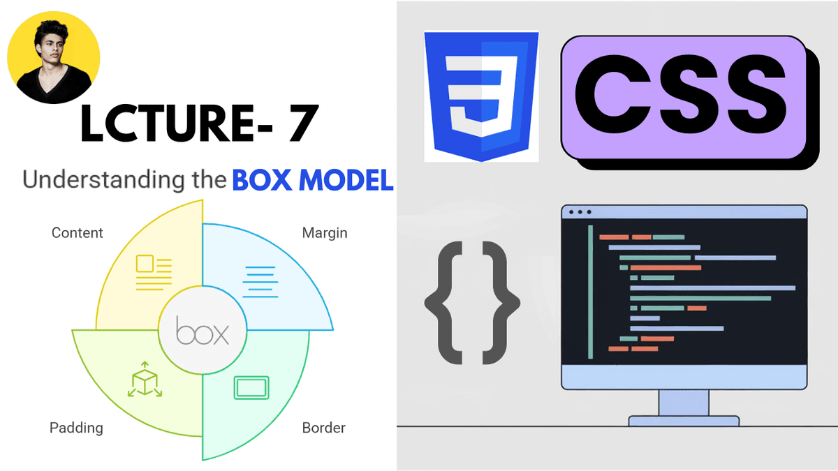
What is the CSS Box Model?
The CSS Box Model defines how elements are structured and spaced on a webpage.
Every element contains four main parts:
| Part | Purpose |
|---|---|
| Content | Actual text or element content |
| Padding | Space inside the element |
| Border | Border around the element |
| Margin | Space outside the element |
These layers work together to control the total size and spacing of an element.
Visual Structure of the Box Model
  Margin
  Border
    Padding
      Content
This structure is the foundation of CSS layouts.
1. Content Area
The content area contains the actual content inside the element.
Example:
  <div>
  Hello World
</div>
The text "Hello World" is the content.
The width and height properties usually affect this area.
2. Padding
Padding creates space inside the element between content and border.
Example:
  .box {
  padding: 20px;
}
This adds internal spacing around the content.
Padding improves readability and visual spacing.
Padding Example
HTML:
  <div class="box">
  Content
</div>
CSS:
  .box {
  padding: 20px;

  background: purple;
  color: white;
}
The content now has breathing space inside the box.
Why Padding Matters
Without padding:
padding: 0;
Content may touch the edges.
Bad user experience.
Better:
padding: 16px;
This creates cleaner UI design.
Modern interfaces rely heavily on spacing systems.
3. Border
The border surrounds the padding and content.
Example:
  .box {
  border: 2px solid black;
}
Structure:
width style color
This creates a visible border around the element.
Border Example
  .card {
  border: 1px solid #d1d5db;
}
Very common in:
- cards
- forms
- buttons
- dashboards
4. Margin
Margin creates space outside the element.
Example:
  .box {
  margin: 30px;
}
This pushes other elements away.
Margin controls external spacing.
Margin Example
  .card {
  margin-bottom: 20px;
}
Very common in:
- blog layouts
- card spacing
- sections
- component systems
Complete Box Model Example
HTML:
  <div class="card">
  Modern Card
</div>
CSS:
  .card {
  width: 300px;

  padding: 20px;

  border: 2px solid #ddd;

  margin: 30px;

  background: white;
}
This creates a fully structured box model layout.
How Total Width is Calculated
Important beginner concept.
Example:
  .box {
  width: 300px;

  padding: 20px;

  border: 5px solid black;
}
Actual total width becomes:
300 + 40 + 10 = 350px
Why?
| Part | Size |
|---|---|
| Width | 300px |
| Left + Right Padding | 40px |
| Left + Right Border | 10px |
This is the default CSS behavior.
The box-sizing Property
Modern frontend development usually uses:
box-sizing: border-box;
This changes how width and height are calculated.
Example:
  * {
  box-sizing: border-box;
}
Now:
- padding
- border
are included inside the defined width.
This creates more predictable layouts.
Why border-box is Important
Without border-box , layouts can become difficult to manage.
Modern frameworks like:
- Tailwind CSS
- Bootstrap
- modern resets
usually apply:
box-sizing: border-box;
globally.
Content-Box vs Border-Box
| Value | Behavior |
|---|---|
content-box | Default browser behavior |
border-box | Includes padding and border inside width |
Modern developers almost always prefer border-box .
Real-World Example
Modern button design:
HTML:
  <button class="btn">
  Get Started
</button>
CSS:
  .btn {
  padding: 12px 20px;

  border: none;

  background: purple;
  color: white;

  border-radius: 8px;
}
This structure relies heavily on the box model.
Margin vs Padding
One of the biggest beginner confusions.
| Property | Purpose |
|---|---|
| Padding | Space inside |
| Margin | Space outside |
Example:
  padding: 20px;
margin: 20px;
Both create spacing but in different locations.
Common Beginner Mistakes
Using margin instead of padding
This creates incorrect spacing behavior.
Ignoring box-sizing
Can cause layout overflow problems.
Adding random spacing values
Modern UI systems use consistent spacing scales.
Forgetting total width calculations
Can break responsive layouts.
Box Model in Modern Frontend Development
The box model is heavily used in:
- React applications
- Next.js layouts
- Tailwind CSS systems
- dashboards
- cards
- forms
- navigation bars
Every frontend layout depends on the box model.
Production Tip
Professional frontend developers usually:
- use
box-sizing: border-box - maintain consistent spacing systems
- avoid random margins
- use scalable padding values
- design mobile-first layouts
Good spacing dramatically improves UI quality.
Real-World Use Cases
The box model is used in:
- cards
- buttons
- forms
- modals
- dashboards
- blog layouts
- navigation bars
- responsive grids
Every modern UI component depends on proper spacing architecture.
Why the Box Model Matters
Understanding the box model helps developers build:
- cleaner layouts
- scalable UI systems
- responsive designs
- professional interfaces
Spacing and layout quality directly affect user experience.
Conclusion
The CSS Box Model is one of the foundational concepts of frontend development.
Understanding content, padding, border, margin, and box-sizing helps developers create structured and scalable user interfaces.
As you move into Flexbox, Grid, Tailwind CSS, React, and Next.js, the box model becomes even more important because modern frontend systems rely heavily on clean spacing and layout architecture.