React Dark Mode and Light Mode Toggle Explained
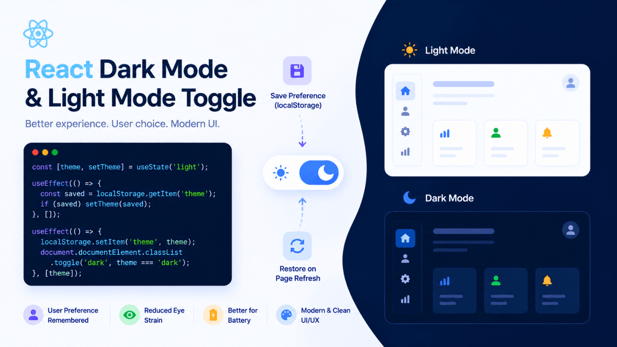
Learn how to build a Dark Mode and Light Mode Toggle in React. Understand useState, useEffect, localStorage, Tailwind CSS dark mode, and theme persistence.
React Dark Mode and Light Mode Toggle: Build Theme Switching in React
Modern websites and applications often allow users to switch between light mode and dark mode.
Examples include:
- GitHub
- YouTube
- X (Twitter)
- Notion
- ChatGPT
Theme switching improves user experience and allows users to choose the interface they find most comfortable.
In React applications, implementing a Dark Mode and Light Mode Toggle is a common feature and an excellent project for learning state management and browser storage.
In this guide, you'll learn how to build a theme toggle system in React and persist user preferences across page refreshes.
Prerequisites
Before learning theme switching, make sure you understand:
These concepts are used throughout the implementation.
What is Dark Mode?
Dark Mode is a theme where the application uses dark backgrounds and light text.
Example:
  Background: Dark

Text: Light
Common benefits:
- reduced eye strain
- improved readability at night
- modern appearance
- battery savings on OLED screens
What is Light Mode?
Light Mode is the traditional theme used by most websites.
Example:
  Background: Light

Text: Dark
Benefits:
- familiar interface
- excellent readability in bright environments
- widely used across websites
Why Do We Need Theme Switching?
Different users have different preferences.
Example:
  User A → Light Mode

User B → Dark Mode
Allowing users to switch themes improves accessibility and user experience.
Understanding Theme Toggle Flow
  User Clicks Toggle

↓

Theme Changes

↓

Save Preference

↓

Restore on Refresh
This is how most modern applications implement theme switching.
Creating State for Theme
Use React State to track the active theme.
  import { useState } from "react";

function App() {

  const [theme, setTheme] =
    useState("light");

}
Initial theme:
light
Creating Toggle Function
Example:
  const toggleTheme = () => {

  setTheme(
    theme === "light"
      ? "dark"
      : "light"
  );

};
This switches between the two themes.
Basic Theme Toggle Example
  import { useState } from "react";

function App() {

  const [theme, setTheme] =
    useState("light");

  const toggleTheme = () => {

    setTheme(
      theme === "light"
        ? "dark"
        : "light"
    );

  };

  return (

    <div>

      <button
        onClick={toggleTheme}
      >
        Toggle Theme
      </button>

    </div>

  );

}
The theme changes whenever the button is clicked.
Applying Theme Classes
Example:
  <div
  className={theme}
>
  Content
</div>
CSS:
  .light {
  background: white;
  color: black;
}

.dark {
  background: #111827;
  color: white;
}
Now the UI changes based on the selected theme.
Complete Example
  import { useState } from "react";

function App() {

  const [theme, setTheme] =
    useState("light");

  const toggleTheme = () => {

    setTheme(
      theme === "light"
        ? "dark"
        : "light"
    );

  };

  return (

    <div className={theme}>

      <button
        onClick={toggleTheme}
      >
        Toggle Theme
      </button>

      <h1>
        React Theme Switcher
      </h1>

    </div>

  );

}
This creates a working theme switcher.
Saving Theme Using localStorage
Without storage:
  Refresh Page

↓

Theme Resets
To remember user preferences:
  localStorage.setItem(
  "theme",
  theme
);
Store the theme whenever it changes.
Loading Saved Theme
Use useEffect:
  useEffect(() => {

  const savedTheme =
    localStorage.getItem(
      "theme"
    );

  if (savedTheme) {

    setTheme(savedTheme);

  }

}, []);
Now the selected theme is restored automatically.
Updating localStorage
Example:
  useEffect(() => {

  localStorage.setItem(
    "theme",
    theme
  );

}, [theme]);
Whenever the theme changes, storage updates as well.
Production-Level Theme Toggle
  import {
  useState,
  useEffect
} from "react";

function App() {

  const [theme, setTheme] =
    useState("light");

  useEffect(() => {

    const savedTheme =
      localStorage.getItem(
        "theme"
      );

    if (savedTheme) {

      setTheme(savedTheme);

    }

  }, []);

  useEffect(() => {

    localStorage.setItem(
      "theme",
      theme
    );

  }, [theme]);

  return (

    <div className={theme}>

      <button
        onClick={() =>
          setTheme(
            theme === "light"
              ? "dark"
              : "light"
          )
        }
      >
        Toggle Theme
      </button>

    </div>

  );

}
This is a common approach used in real projects.
Theme Toggle with Tailwind CSS
Tailwind provides built-in dark mode support.
Tailwind Config:
darkMode: "class"
Component:
  <div
  className="
    bg-white
    text-black
    dark:bg-gray-900
    dark:text-white
  "
>
  Content
</div>
Toggle:
  document.documentElement
  .classList
  .toggle("dark");
This is the preferred method in Tailwind projects.
Adding Theme Icons
Many applications use icons.
Example:
  ☀️ Light Mode

🌙 Dark Mode
Using React Icons:
  import {
  FaMoon,
  FaSun
} from "react-icons/fa";
This improves user experience.
Real Project Usage
Portfolio Websites
Allow visitors to choose their preferred theme.
SaaS Dashboards
Remember user preferences across sessions.
Blog Platforms
Provide comfortable reading experiences.
Documentation Websites
Improve readability for developers.
Theme switching is now considered a standard feature.
Common Real-World Use Cases
Dark Mode is commonly used in:
- dashboards
- portfolios
- blogs
- documentation sites
- admin panels
- productivity apps
Most modern applications support both themes.
Common Beginner Mistakes
Forgetting localStorage
Without persistence:
  Refresh

↓

Theme Lost
Always store user preferences.
Not Loading Saved Theme
Users expect their preference to remain unchanged.
Hardcoding Colors
Avoid:
background: black;
Use reusable theme classes instead.
Ignoring System Preferences
Some users prefer:
prefers-color-scheme
Production applications often respect system settings.
Dark Mode Interview Questions
- What is Dark Mode?
- Why do websites provide theme switching?
- How do you implement Dark Mode in React?
- Why is localStorage used?
- What is the role of useEffect?
- How does Tailwind Dark Mode work?
- How can you persist theme preferences?
Watch Full Theme Toggle Tutorial
If you prefer video learning, watch the complete tutorial below where we build a production-ready Dark Mode and Light Mode Toggle in React.
Watch the Full Theme Toggle Tutorial
This tutorial demonstrates theme management patterns commonly used in professional React applications.
Build Something
Practice theme switching by creating:
- Developer Portfolio
- Blog Website
- Documentation Platform
- SaaS Dashboard
- Admin Panel
These projects will help you implement production-ready theme systems.
Production Tip
Professional React developers usually:
- persist themes using localStorage
- support system preferences
- use CSS variables or Tailwind classes
- avoid flashing during page load
- centralize theme management
A well-designed theme system improves usability and user satisfaction.
Why Dark Mode Matters
Users spend hours interacting with web applications.
Providing both Light Mode and Dark Mode gives users control over their experience and improves accessibility.
Theme switching has become an expected feature in modern applications.
Conclusion
A Dark Mode and Light Mode Toggle is one of the most useful features you can add to a React application.
Using React State, useEffect, and localStorage, you can create a theme system that remembers user preferences and delivers a professional user experience.
Mastering theme switching is a valuable skill for building modern React applications.