CSS Shadow Properties Explained with Examples for Beginners
Learn CSS shadow properties with practical examples. Understand box-shadow, text-shadow, blur, spread, inset shadows, layered shadows, and modern UI depth techniques.
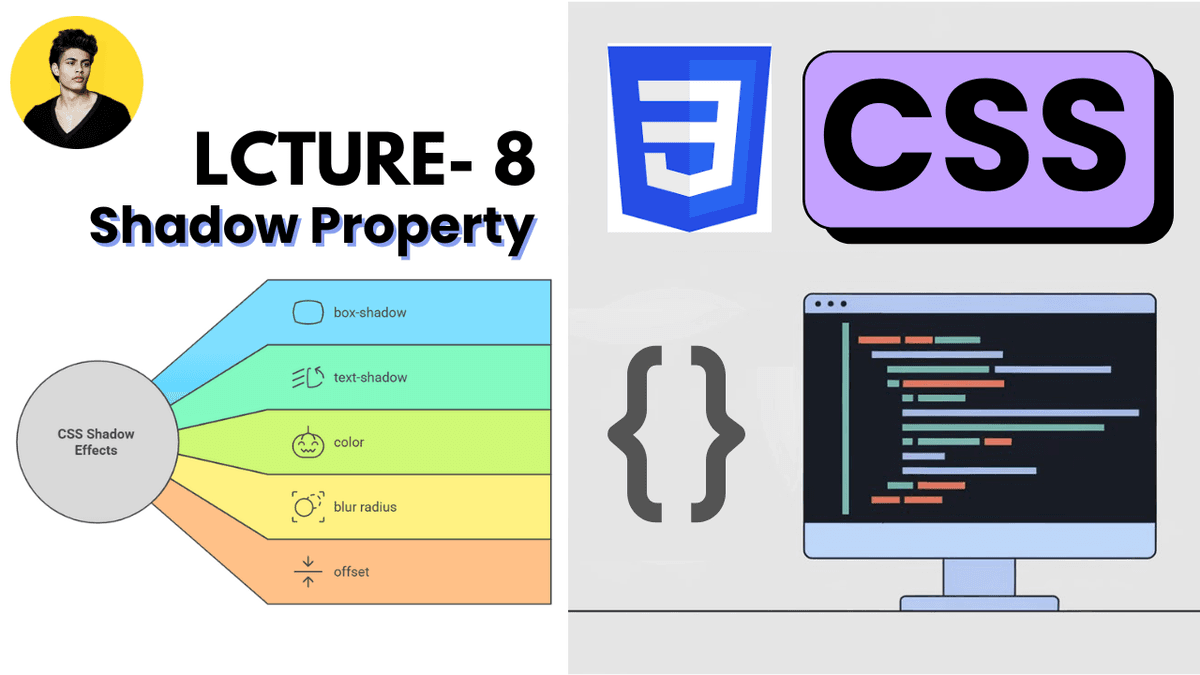
CSS Shadow Properties Explained with Examples
CSS shadow properties are used to add depth, focus, and visual hierarchy to elements.
Modern websites use shadows heavily to create:
- cards
- modals
- buttons
- floating elements
- glassmorphism effects
- professional UI systems
Well-designed shadows can make interfaces feel modern and polished, while poor shadow usage can make designs look outdated or cluttered.
What are CSS Shadow Properties?
CSS provides two main shadow properties:
| Property | Purpose |
|---|---|
box-shadow | Adds shadow to elements |
text-shadow | Adds shadow to text |
These properties are widely used in frontend development and modern UI design systems.
1. Box Shadow Property
The box-shadow property adds shadow effects around elements.
Basic example:
  .card {
  box-shadow: 0 4px 10px gray;
}
This creates a shadow around the card element.
Box Shadow Syntax
horizontal vertical blur color
Example:
box-shadow: 0 4px 12px rgba(0, 0, 0, 0.2);
| Value | Purpose |
|---|---|
0 | Horizontal offset |
4px | Vertical offset |
12px | Blur amount |
rgba(...) | Shadow color |
Basic Card Example
HTML:
  <div class="card">
  Modern Card
</div>
CSS:
  .card {
  padding: 20px;

  background: white;

  box-shadow: 0 4px 15px rgba(0, 0, 0, 0.1);
}
This creates a modern card-style shadow.
Very common in:
- dashboards
- SaaS applications
- admin panels
- blog cards
Understanding Shadow Blur
Small blur:
box-shadow: 0 2px 4px black;
Sharp shadow.
Large blur:
box-shadow: 0 10px 30px black;
Soft shadow.
Modern UI systems usually prefer softer shadows.
Shadow Spread Radius
The optional fourth value controls shadow spread.
Example:
box-shadow: 0 4px 10px 2px gray;
Structure:
horizontal vertical blur spread color
Spread controls shadow size expansion.
Multiple Shadows
CSS supports multiple shadows.
Example:
  box-shadow:
  0 2px 5px rgba(0,0,0,0.1),
  0 10px 20px rgba(0,0,0,0.1);
This creates layered depth.
Modern design systems often use multiple shadow layers.
Inset Shadows
The inset keyword creates inner shadows.
Example:
box-shadow: inset 0 2px 5px gray;
Common uses:
- input fields
- neumorphism UI
- pressed button effects
Real-World Button Example
HTML:
  <button class="btn">
  Get Started
</button>
CSS:
  .btn {
  padding: 12px 20px;

  background: purple;
  color: white;

  border: none;
  border-radius: 8px;

  box-shadow: 0 6px 15px rgba(124, 58, 237, 0.3);
}
This creates a modern elevated button effect.
2. Text Shadow Property
The text-shadow property adds shadow effects to text.
Example:
  h1 {
  text-shadow: 2px 2px 5px gray;
}
This creates a shadow behind the text.
Text Shadow Syntax
horizontal vertical blur color
Example:
text-shadow: 0 2px 10px black;
Very common in:
- hero sections
- banners
- marketing websites
Hero Section Example
HTML:
  <h1 class="hero-title">
  Build Modern Websites
</h1>
CSS:
  .hero-title {
  color: white;

  text-shadow: 0 4px 20px rgba(0,0,0,0.5);
}
This improves text readability over images.
Shadow Colors
Modern shadows often use transparent colors.
Example:
box-shadow: 0 4px 15px rgba(0,0,0,0.15);
RGBA shadows create softer and more realistic effects.
Professional UI systems rarely use pure black shadows.
Modern Shadow Design Trends
Modern frontend interfaces usually use:
- soft shadows
- layered shadows
- subtle depth
- transparent shadows
Popular in:
- glassmorphism
- neumorphism
- SaaS dashboards
- modern landing pages
Common Beginner Mistakes
Using overly dark shadows
Heavy shadows can make UI feel outdated.
Using large blur everywhere
Excessive blur reduces visual clarity.
Adding shadows to everything
Too many shadows create visual clutter.
Using pure black shadows
RGBA shadows usually look more professional.
Box Shadow vs Border
Important difference:
| Property | Purpose |
|---|---|
border | Creates visible edge |
box-shadow | Creates depth effect |
Modern UI systems often combine both.
Shadow Properties in Modern Frontend Development
Shadow systems are heavily used in:
- React applications
- Next.js projects
- Tailwind CSS
- component libraries
- dashboards
- modals
- dropdown systems
Modern frontend design relies heavily on depth and layering.
Production Tip
Professional frontend developers usually:
- use subtle shadows
- maintain consistent elevation systems
- avoid heavy black shadows
- combine shadows with border-radius
- use layered shadow systems
Good shadow systems dramatically improve interface quality.
Real-World Use Cases
Shadow properties are used in:
- cards
- buttons
- modals
- dropdown menus
- hero sections
- navigation bars
- popups
- dashboards
Almost every modern UI system uses shadows.
Why Shadow Properties Matter
Good shadow design improves:
- visual hierarchy
- depth perception
- UI focus
- interaction clarity
- overall user experience
Shadows help interfaces feel more modern and interactive.
Conclusion
CSS shadow properties are essential for creating modern and visually polished user interfaces.
Understanding box-shadow and text-shadow helps developers build professional frontend systems with proper depth and visual hierarchy.
As you move into advanced CSS, Tailwind CSS, React, and design systems, shadow styling becomes even more important because modern applications rely heavily on layered and elevated UI components.