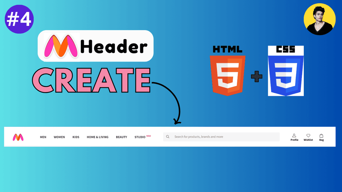
Build a Myntra Header Using HTML and CSS
Learn how to build a modern Myntra-style header using HTML and CSS. Understand Flexbox layouts, responsive navigation, search bars, hover effects, and modern UI structure.
Build a Myntra Header Using HTML and CSS
Building real-world UI components is one of the best ways to improve frontend development skills.
In this tutorial, we will create a responsive e-commerce style header inspired by modern shopping platforms like Myntra using only:
- HTML
- CSS
This project helps beginners understand:
- Flexbox layouts
- spacing systems
- navigation design
- search bar styling
- responsive structure
- modern UI alignment
Projects like this are very useful for improving practical frontend development skills.
What We Will Build
The header will include:
- logo section
- navigation menu
- search bar
- action icons
- responsive layout structure
This type of layout is commonly used in:
- e-commerce websites
- SaaS dashboards
- admin panels
- modern web applications
Final UI Structure
Our layout structure:
Logo | Navigation | Search Bar | Icons
We will build this step-by-step.
Project Folder Structure
  project/
│
├── index.html
└── style.css
Simple and beginner-friendly structure.
Step 1: Create HTML Structure
Create index.html .
  <!DOCTYPE html>
<html lang="en">
<head>
  <meta charset="UTF-8" />

  <meta
    name="viewport"
    content="width=device-width, initial-scale=1.0"
  />

  <title>Myntra Header Clone</title>

  <link
    rel="stylesheet"
    href="style.css"
  />
</head>

<body>

  <header class="header">

    <div class="logo">
      Myntra
    </div>

    <nav class="nav-links">
      <a href="#">Men</a>
      <a href="#">Women</a>
      <a href="#">Kids</a>
      <a href="#">Home</a>
      <a href="#">Beauty</a>
    </nav>

    <div class="search-box">
      <input
        type="text"
        placeholder="Search for products"
      />
    </div>

    <div class="icons">
      <span>Profile</span>
      <span>Wishlist</span>
      <span>Bag</span>
    </div>

  </header>

</body>
</html>
This creates the complete header structure.
Understanding the Layout
The header contains four main sections:
| Section | Purpose |
|---|---|
| Logo | Brand identity |
| Navigation | Menu links |
| Search Box | Product search |
| Icons | User actions |
This structure is commonly used in e-commerce websites.
Step 2: Add Basic CSS Reset
Create style.css .
  * {
  margin: 0;
  padding: 0;

  box-sizing: border-box;
}
This removes default browser spacing issues.
Modern frontend projects usually start with a reset.
Step 3: Style the Body
  body {
  font-family: Arial, sans-serif;

  background: #f5f5f5;
}
This creates a cleaner base UI.
Step 4: Create Header Layout
  .header {
  height: 80px;

  background: white;

  display: flex;

  align-items: center;

  justify-content: space-between;

  padding: 0 40px;

  box-shadow:
    0 2px 10px rgba(0,0,0,0.05);
}
This creates a modern horizontal layout using Flexbox.
Understanding the Header CSS
| Property | Purpose |
|---|---|
display: flex | Creates flexible layout |
align-items | Vertical alignment |
justify-content | Horizontal spacing |
padding | Internal spacing |
box-shadow | Modern elevation effect |
This structure is heavily used in modern frontend development.
Step 5: Style the Logo
  .logo {
  font-size: 28px;

  font-weight: bold;

  color: #ff3f6c;

  cursor: pointer;
}
This creates a Myntra-inspired brand style.
Step 6: Style Navigation Links
  .nav-links {
  display: flex;

  gap: 25px;
}

.nav-links a {
  text-decoration: none;

  color: #282c3f;

  font-weight: 600;

  font-size: 14px;
}
This creates a clean navigation menu.
Add Hover Effect
  .nav-links a:hover {
  color: #ff3f6c;
}
This improves user interaction feedback.
Modern interfaces heavily rely on hover states.
Step 7: Style the Search Box
  .search-box input {
  width: 320px;

  padding: 10px 15px;

  border: none;

  background: #f5f5f6;

  border-radius: 5px;

  outline: none;
}
This creates a clean e-commerce style search input.
Step 8: Style Action Icons
  .icons {
  display: flex;

  gap: 20px;

  font-size: 14px;

  font-weight: 500;

  color: #282c3f;
}

.icons span {
  cursor: pointer;
}
This creates action buttons similar to modern shopping websites.
Add Hover Effects to Icons
  .icons span:hover {
  color: #ff3f6c;
}
This improves interactivity.
Complete Final CSS
  * {
  margin: 0;
  padding: 0;

  box-sizing: border-box;
}

body {
  font-family: Arial, sans-serif;

  background: #f5f5f5;
}

.header {
  height: 80px;

  background: white;

  display: flex;

  align-items: center;

  justify-content: space-between;

  padding: 0 40px;

  box-shadow:
    0 2px 10px rgba(0,0,0,0.05);
}

.logo {
  font-size: 28px;

  font-weight: bold;

  color: #ff3f6c;

  cursor: pointer;
}

.nav-links {
  display: flex;

  gap: 25px;
}

.nav-links a {
  text-decoration: none;

  color: #282c3f;

  font-weight: 600;

  font-size: 14px;
}

.nav-links a:hover {
  color: #ff3f6c;
}

.search-box input {
  width: 320px;

  padding: 10px 15px;

  border: none;

  background: #f5f5f6;

  border-radius: 5px;

  outline: none;
}

.icons {
  display: flex;

  gap: 20px;

  font-size: 14px;

  font-weight: 500;

  color: #282c3f;
}

.icons span {
  cursor: pointer;
}

.icons span:hover {
  color: #ff3f6c;
}
This creates the full modern header UI.
Make the Header Responsive
Modern websites must support smaller devices.
Add Media Query:
  @media (max-width: 900px) {

  .nav-links {
    display: none;
  }

  .search-box input {
    width: 180px;
  }

}
This improves mobile responsiveness.
What You Learn From This Project
This project teaches:
- Flexbox layouts
- responsive design
- navigation structure
- spacing systems
- hover interactions
- search bar styling
- real-world UI building
These concepts are heavily used in frontend development.
Common Beginner Mistakes
Using too much spacing
Large spacing can break layouts.
Ignoring responsive design
Modern layouts must adapt to smaller screens.
Not using Flexbox properly
Flexbox simplifies alignment significantly.
Overcomplicating structure
Professional UI systems usually keep layouts simple.
Real-World Improvements
You can further improve this project by adding:
- SVG icons
- mobile menu
- dropdown navigation
- dark mode
- animations
- sticky header
- search suggestions
These features are commonly used in production applications.
Modern Frontend Development Insight
Headers are one of the most important parts of frontend architecture.
Professional applications often focus heavily on:
- clean navigation
- responsive behavior
- accessibility
- search UX
- performance
Good header design dramatically improves user experience.
Production Tip
Professional frontend developers usually:
- use reusable header components
- maintain consistent spacing systems
- optimize navigation UX
- support mobile responsiveness
- use scalable layout architecture
Header quality strongly affects overall UI quality.
Why Building UI Clones Helps
UI cloning helps developers:
- improve practical skills
- understand real-world layouts
- learn spacing systems
- practice responsive design
- improve frontend confidence
Building real interfaces is one of the fastest ways to improve frontend development skills.
Conclusion
Creating a Myntra-style header using HTML and CSS is an excellent project for improving frontend development skills.
This project teaches important concepts like Flexbox, responsive layouts, spacing systems, hover interactions, and modern UI structure.
As you move into advanced frontend development with Tailwind CSS, React, and Next.js, these layout and UI principles become even more important because modern applications rely heavily on scalable and responsive component architecture.